
Basket & Checkout User Testing
Goal: Test new Basket and Checkout flow of Nando’s app to validate design ideas and observe user behavior. Assess understanding and ease of placing both delivery and collect orders within the app.
My Role: UX Researcher The Team: Lead UX Researcher, UX Researcher, 2 UX Designers, 2 UI Designers
Research Questions
How jarring is for people to go to login from when they tap on ‘PAY NOW’?
How do users find the pricing information and totals in checkout?
Do users know how to add/edit delivery address, billing address, and payment details?
How useful and easy to understand are the error messages on the payment details page?
Can users successfully add a Nando’s Loyalty Card?
Do users understand how to add rider notes?
Do users notice/understand the 2 CTA’s on the Search page?
Are users able to successfully customise their order via the PDP?
How do users feel about the allergens information and its display on the PDP?
What are users thoughts and understanding of the ‘Pay Now’ vs ‘View Basket’ CTAs?
Can users successfully edit the quantity of items in the basket?
Do people see the charges at the end of the screen?
Methodology
Interviews:
8 user interviews were conducted in Nando’s HQ office.
Sessions were 1 hour long, and comprised of:
Brief background interview
2 main tasks
Place a delivery order
Complete a collection check out process
Design comparison of a light and dark version of the app
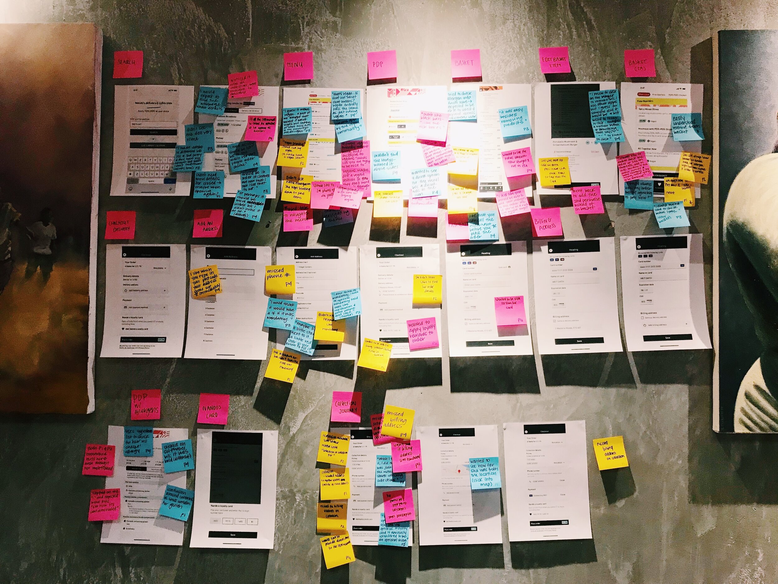
Teammates observed and took notes from a separate observation room (photo left).

Prototypes being tested:

Delivery Journey

Collection Checkout Journey
Dark UI
Analysis Process
Lead UX Researcher facilitated interview from upstairs research room. Both interviewee’s face and screen behavior was recorded and streamed live.
Remaining members of the team took notes from separate observation room.
After each test segment, observation room attendees discussed and transferred key findings to post-it notes - placing each note on corresponding app page (printed flow seen right).
Lead UX Researcher also attended each retro to add additional in-person insights.
Key Findings
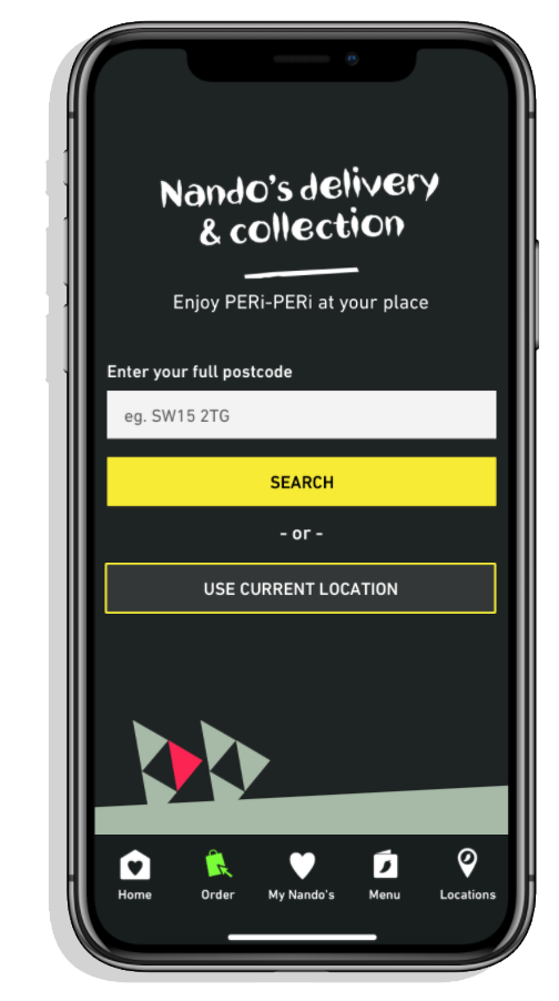
Locate Page
Main finding: Many participants didn’t notice the fulfilment method tabs at the top of the page. This issue was uncovered in previous research and the UXD team is already looking into it.
Design Issue: The need to select between the 2 fulfilment methods is not clear or visible enough on 'Locate' page.
Design Recommendation: Change UI to make selected state more noticeable.


Menu
Main finding: All users failed in understanding the actual meaning of 'vegan friendly' phrase. The general perception was that it matches Nando's playful tone of voice. It was also seen as a way of promoting the variety of menu options and the brand's intention of being inclusive.
Design Issue: Clear usage of language is recommended when communicating allergy information.
Design Recommendation: Change UI to make selected state more noticeable.
“I think ‘vegan friendly’ suggests that.. since people associate you with chicken, you will be nice to vegan too... I get why you did vegan-friendly because it makes it seem like oh you’re trying to be welcoming to vegans.” - P2
PDP
Main finding: All users failed in understanding the actual meaning of 'vegan friendly' phrase. The general perception was that it matches Nando's playful tone of voice. It was also seen as a way of promoting the variety of menu options and the brand's intention of being inclusive.
Design Issue: The interaction model for creating a meal seems to not match users’ expectations.
Design Recommendation: Complete page redesign — Note: Meal creation has been tested in 3 user test studies and proved to not be clear enough for some users. UX team will be looking into redesigning the page.
“I would expect them to be after the heat level… the ‘Choose Your Meal’ kind of confused me there.” - P6


Checkout Flow
Main findings:
A few participants missed some of the mandatory fields, as they couldn’t recognise them as mandatory:
‘Phone number’ under Delivery address (Delivery journey) and ‘Billing address’ under Payment details (Collect journey)
They would expect to get an error message and be guided by the app on how to proceed if that happened.
Almost all participants were confused by the way the delivery and collection time was communicated. (i.e collection time available at 12:00, deliver at 12:00)
Design Issue: There were some elements on the page that were not visible or clear enough.
Design Recommendation: Edit field and error message UI to better guide users.
“...I think it means the restaurant does collection from 12:00 onwards? ”-P7
Dark vs Light Interface
Main finding: The user feedback about the different backgrounds was mixed, but helped us understand users expectations and preferences.
Points Mentioned:
People associate Nando’s with a joyful colourful brand
Dark is seen as a night mode (advanced users would appreciate the ability to choose between day or night mode i.e. Twitter app)
Some had concerns that the dark background might not be accessibility compliant
Visual consistency is expected across the app (even though some users preferred the dark background only on the menu page, they mentioned the app needs to be consistent)
NOTE*: The prototypes showing the 2 backgrounds were quite different in terms of interaction complexity, content, font size and screen size and some of the users’ feedback might be biased.
*Further testing is needed.

Reporting and Next Steps
Reviewed test recordings to cut and save note-able video clips
Created detailed deck of Test Overview, Methods, and Key Findings and made accessible to full product team
Hosted an in-person retro with Key Stakeholders and necessary designers to go over key findings and discuss priority level of findings
Full deck available upon request - pending approval from Nando’s UK & IRE.