
Put your waste to good use.
As global temperatures continue to rise, climate change and sustainability remain top of mind across the world. Yet while many individuals say they care about the environment, they are often left confused and uneducated about ways they can help. A team of cross-disciplinary students from Kingston University set out to create a solution to this problem.

The Challenge
Collaborate with a cross-functional team of Digital Media Masters students to address creative problem solving, collaborative research and development, and an interdisciplinary approach to an assigned brief.
Kington University, MSc UX Design Project
My Role: UI/UX Designer and Team Lead
Designed visual identity along with product UI and Style Guide. Created high fidelity mockups and facilitated testing/iterating at this level. Led the team in organization of deadlines, ran meetings, and oversaw individual progress to meet project goals.
The Team: Game Designer, 2 UX Researchers, UX Designer, UI/UX Designer, Animator
The Timeline: 8 weeks
Design Process

Overview
The problem: As humans, everyday waste is inevitable. Yet while people say they want to help reduce it, they feel they don’t have accessible information, resources and education to do so in daily life.
The solution: Use Augmented Reality to provide accurate real-time information, recycling option guidance, and interactive elements that encourage more sustainable choices and education.
Solution Values
Provide Real-Time information and tool tips of personalized items in an AR experience
Use animation and characters to guide and educate user
Track individual and city impact
Earn rewards to increase engagement
Help the planet - and have fun along the way!
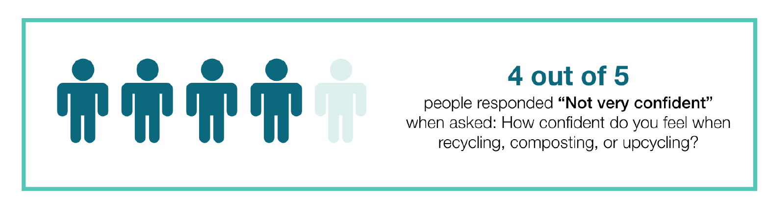
User Pain Points
It requires too much effort to look up all the information I need
The information I need is not convenient or accessible to me
I do not feel confident when trying to dispose of waste correctly
“I guess which bucket things go in a lot.” - Interview Quote

My Role
UI/UX Designer and Team Lead
Designed visual identity along with product UI and Style Guide. Created high fidelity mockups and facilitated testing/iterating at this level. Led the team in organization of deadlines, ran meetings, and oversaw individual progress to meet project goals.
Deliverables included:
Donation Content Research (Storyboarding, Task Analysis, Object Model)
Moodboard and Logo Design
Style Guide
High-Fidelity Mockups V1
Clickable Prototype
User Testing Results
Iterated High-Fidelity Mockups V2
Content Research
Design Requirements
Collaborated with team UX Researcher to understand and create content requirements for the donation flow of the platform. Through the interviewing of multiple organizations and charities, the they gathered insights on organization behaviors, patterns, and pain points as they pertain to accepting donations. In order to define this research as usable design information, the findings were analyzed to create the initial stages of a hypothetical secondary product.
In theory, this secondary product would allow organizations to upload “needs” for items they were seeking donations for. This data would then create the backend parameters and allow the system to match the user with any organisations that were looking for items fitting that same criteria. For this reason, understanding this process was vital to the success off our overall product because it drove what front end capabilities the user would need to have when going through the donation flow.
Hierarchical Task Analysis
Object Model

Notes:
i. Task 3 should occur for specific categories (example: Men’s Winter Clothes) and can be repeated as necessary
ii. Repeat Task 4 as often as needed for specific Task 3
iii. Additional tasks can be taken further for viewing hits, facilitating pick-ups, and adding to inventory (not relevant for current project scope)

Notes:
i. Item details vary based on Category (Ex: hat vs shirt)
ii. Need for a donation form varies per organisation
iii. Item matches only added to Pick-Ups pending organisation approval
Logo Design & Branding
Research:
Brand Goals and Application:
Goal: Act as a reliable source of sustainable education and information.
Solution: Use color to increase feelings of trust and represent elements of nature.
Users form brand opinions within 90seconds, and up to 90% of those assumptions are influenced by color alone
Blue represents: “calm, stable, trust, smart”
(Watson, 2015)
Designing for AR:
Following the Apple Human Interface Guidelines for Augmented Reality, the below best practices were adopted as project design principles for the Style Guide (Developer.apple.com, n.d.):
Maximize the display screen
Use as minimal text in the environment as possible
Provide cues for users to locate and place objects
Simplify user interactions

Moodboard

UI & Style Guide
Style Guide:
A Style Guide was created to translate the visual identity to a useable and actionable digital resource. This was designed and shared as an Adobe XD file with the team to establish a consistent point of truth and reference throughout the team’s individual designs. This was especially valuable to establish consistency within our agile environment, as all product areas were being worked on simultaneously.
Colors:
WCAG Compliance Status for color contrast was checked for accessibility using Cluse plug-in.
UI Elements:
Reusable UI Components were designed to fulfil the needs identified in the lo-fi wireframes. Seen in section 05, they included application rules in order to insure consistency and correct use across all designers.
Iconography:
Non-AR: Simple 2D icons were created to support the non-AR UI elements of Planet Pal. Icons mimicked standard IOS iconography to insure user understanding and comprehension.
AR: AR icons were designed with more dynamic color and contrast to support visibility on less predictable backgrounds. Following Mahmood (2018) best practices, these icons are larger and placed in a gradient container to distinguish them from the camera feed in the background.
All iconography was further tested by users during the usability testing and iterated based on those findings.

High Fidelity Mockups
Version 1: Mockups & Prototype
After analysis of the low fidelity mockups and iterations, the Style Guide and additional research were applied to create hi-fi mockups. Due to the hand-off in designer, internal communication was a key component to the success of the design. A meeting was held to go over the lo-fi user test learnings and understand the technical requirements that drove design decisions. Screens were then annotated to highlight these changes.

User Testing

Goal: In-person, talk aloud protocol
Method: In-person, talk aloud protocol
Participant: Male, 27, London Resident
Task: Navigate through the app and donate your item
Research Questions:
What are users overall opinions of the experience?
Can a user successfully donate an item?
Do users understand the meaning/action of the iconography?
Do users understand what they are expected to do?
Are users missing any information to make their sustainable decision?
Is there anything else users expect to see or do?
Key Findings
Specific UI elements were found distracting
Confusion on the meaning of certain icons
Expressed alternative Organisation details that were important in making a selection


Version 2: Iterations & Mockups
A second iteration of hi-fi mockups were designed based on the usability test findings and internal feedback from the team. In addition to the design elements shown in the usability table, some screens were also added based on technology requirements and overall flow. Using the same format as the V1 Mockups, all screens included annotations that noted user test findings, internal feedback, and any changes that occurred for future reference.
Example of design iteration made from V1 to V2:
Version 1
Map was distracting
Needed to know Drop-Off / Pick-Up capability to make decision
Bookmarking did not feel relevant here

Version 2
Removed map
Pulled out Drop-Off and Pick-Up to top filters
Removed bookmarking and cleaned up content display
Removed top header on AR screens (will appear/hide with tapping the screen) based on User Feedback and Apple AR Guidelines
Full V2 Mockups Created in Adobe XD


Final Deliverable
Collaborating with the team animator, Adobe Aero was used build a believable AR experience. Once the initial interaction was built in the app, the '“Pal” animations were superimposed using Adobe AfterEffects. Due to the lack of a group programmer, the created a believable and engaging demonstration of how a user would interact with the working app.
Additional assets and full student report available upon request.