Recording Toolbar Redesign
While recording a video with Screencastify, users can take advantage of live, on-screen recording tools. These tools allow users to annotate and emphasize content in order to make their recordings more engaging.

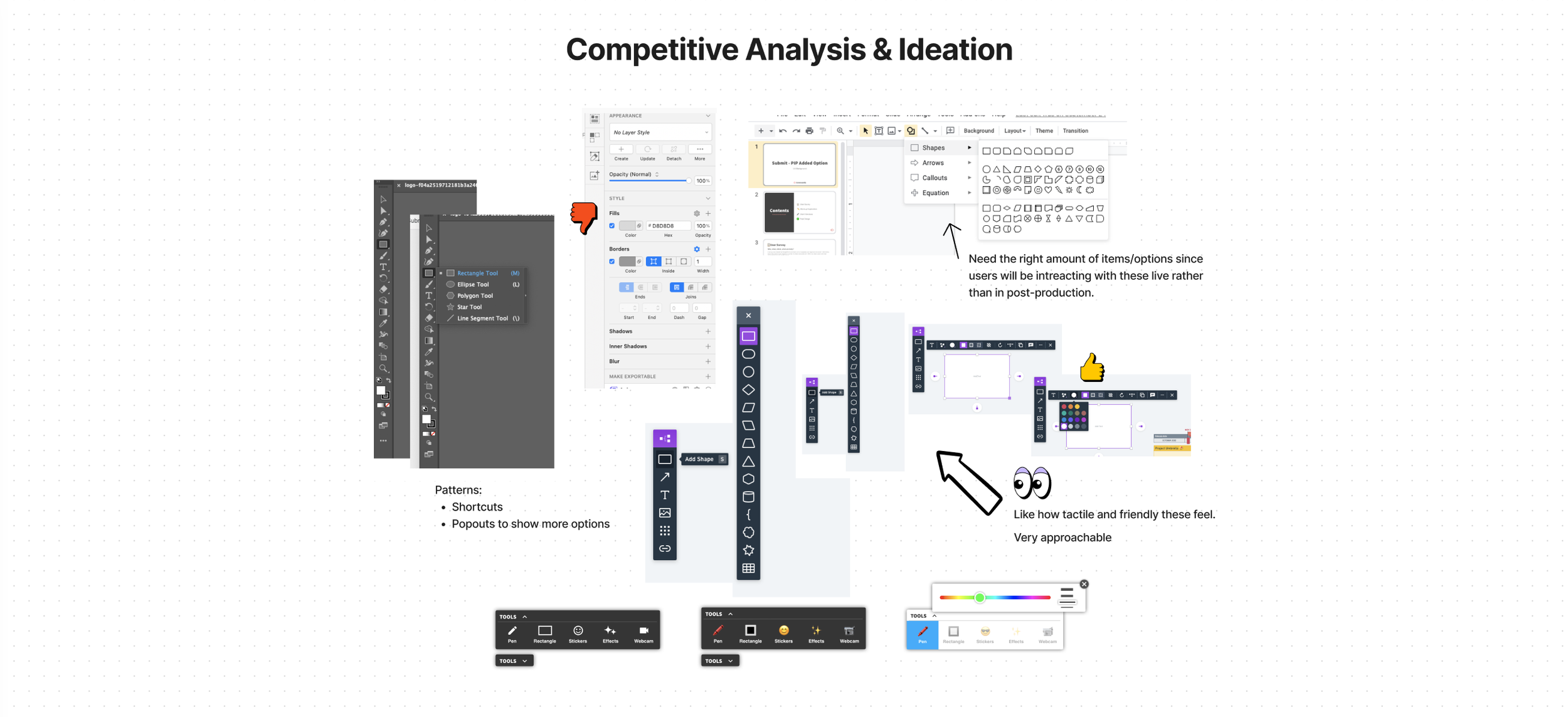
Why the redesign?
Business Goals:
Buzz-worthy feature will entice users to make more videos
Differentiate us from every other screen recording extension
User Goals:
Annotate videos in real-time to reduce my time spent in editing later → allow me to create more content
Add excitement and value to my videos
Keep my viewers engaged through fun effects and useful tools
Fun to use!
📋 User Survey
Methodology:
A survey was created on Google Forms and added as an extension notification for a subset of users: Have created over 29 videos, most recent video was created after September 2020, and email started with “D,E, or F”
Key findings are based on 279 total responses (88.9% Teachers)
Objectives:
The purpose of this survey was to gather a quantitative understanding of how users are interacting with the current toolbar, highlight current pain points, and asses user needs for the new design.
How often are users interacting with the recording tools?
Do users have a clear understanding of how to use these tools?
Do users currently see value in these tools?
Insights on visual/UI preferences:
Size of the tools, taking up screen, etc
General insights around the recording/annotation toolbar.
🔑 Key Findings:
Only 1 in 4 users are actively using the recording annotation tools while filming.
54% of users reported “Never” or “Rarely” using the recording tools, while only 25% said they use them “Always” or “Often”.
This highlights large opportunity for more education/in-product marketing to increase engagement of these tools.
The majority of users do not have an issue with the toolbar size or room it takes up on their screen.
15% of users reported the toolbar size makes it difficult to see.
18% of users reported the toolbar takes up too much space on their screen.
The largest opportunity areas for the tools were identified as:
Increase ease of use
Better communicate value and usefulness of tools.

When asked how we could make these tools better, the most popular answers were:
Make the toolbar moveable (drag it to other areas of the screen)
Be able to easily hide/show the toolbar
Add Stop and Pause to the toolbar
Add more functionality: Highlighter, Line Tool, Rectangle Tool, Laser Pointer, Blur, Green Screen, Sound Effects, Highlight/Track while reading, Insert Images (Bitmojis)
Video tutorials on how to use them
Final Design


👟 Next Steps
Answer remaining open questions:
Do we need to have the eraser visible at all times? (Quick tool)
Is the “Save Mouse” action clear enough to users?
Is it clear that the new toolbar is draggable? Are users discovering this?
Is it clear that the “Mouse” option is clickable?
Specific interaction states once live?
Short Term: Create a testing plan to asses user understanding of the new experience and identify any red flags before full roll out
Long Term: Send out a survey to assess overall project success using initial survey responses as a benchmark